Benefits of Using Hand-Crafted Design for Packaging
Businesses invest so much into creating their products, spending endless nights testing different variations, recipes, and materials. Doesn’t a product’s visual representation deserve the same attention to detail?
Enter hand-drawn packaging design. Over the years I found that starting with pencil and paper allows me to get a ton of ideas out on the page while working on the computer limits me to perfecting concepts out of the gate.
My approach boasts a huge advantage for packaging design projects, as I use my iPad to draw directly on the package template. Whether it is for retail packaging, beer labels, or food boxes, being able to digitally draw on the final product allows for the most creative solutions. I dial in exact product specs and alter the shape and structure of the design to best fit the end goal.
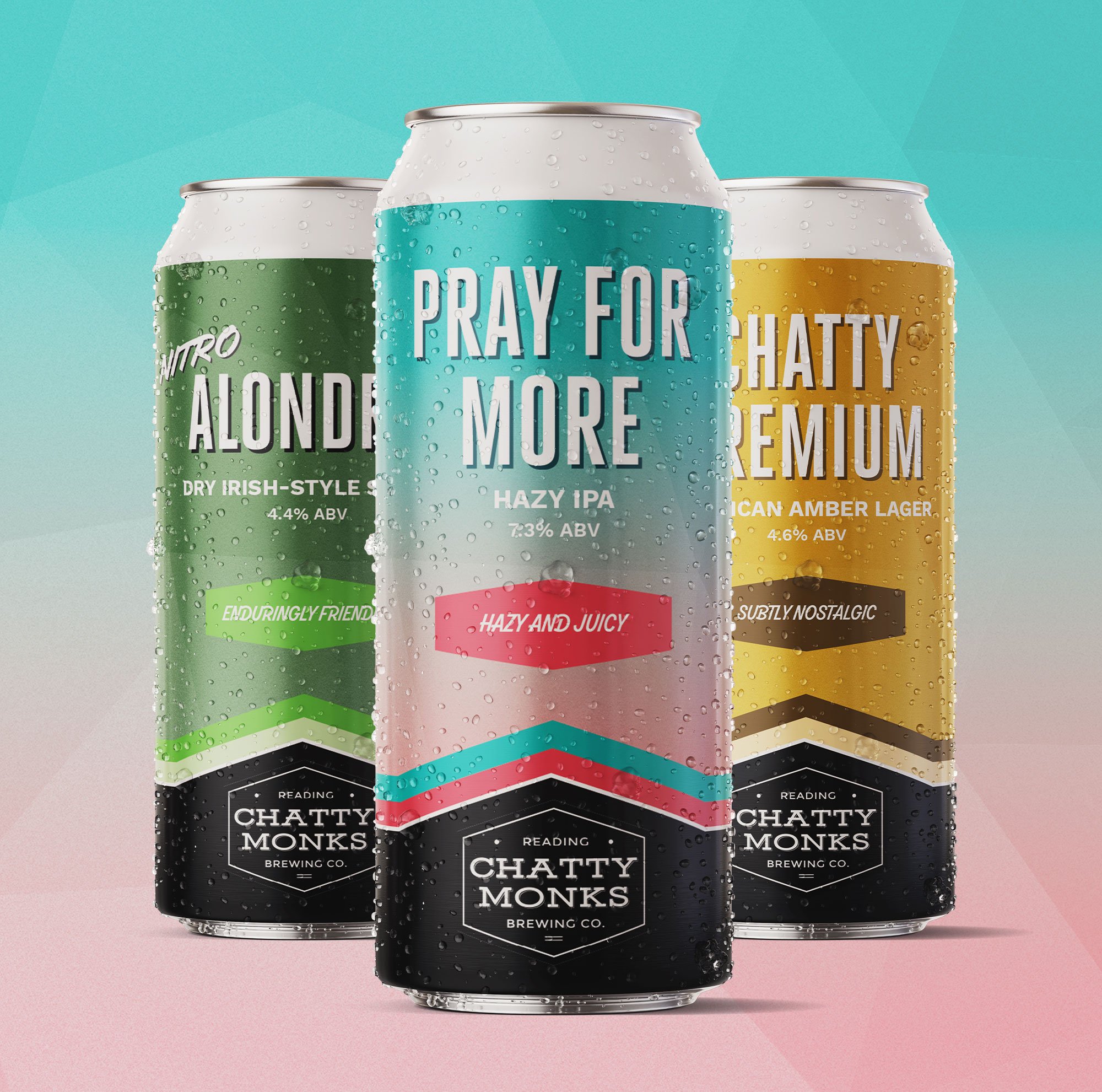
Chatty Monks Brewery
Craft beer label packaging design
Even if the desired look is more buttoned up, I still use this approach to establish the hierarchy of the design. Laying out the design structure by hand has allowed me to unlock unique, custom design solutions.
Like all of my design processes, I start by working with only black and white, as limiting myself to these colors allows me to find the best design solution. Once I find the best alignment for the packaging, I add the bells and whistles.
Below are two examples of packaging designs I have created
If you or your brand are launching a product that lives out in the world I strongly recommend using hand-drawn packaging design. If you would like to learn more about me and my approach to packaging design projects, use the link below to start the conversation.
Did you enjoy this content?
If so make sure to sign up for my newsletter using the form below and you will be the first to be notified when more articles like this are published!


